Viewing: design

Salone del Mobile at the Universita di Milano

Walking around a furniture fair for a couple days, one inevitably sees a lot of kitchens, bathrooms, toilets and chairs—especially chairs. (Why do all designers seem to be hell-bent on reinventing the chair?) After a while, it all got to be a bit too much for me. So on our last day in Milan, I suggested that we look for some of the large-scale installations I’d been seeing on Instagram, most of which seemed to be concentrated in the Universita di Milano.

Milan Salone del Mobile 2014 Universita di Milano

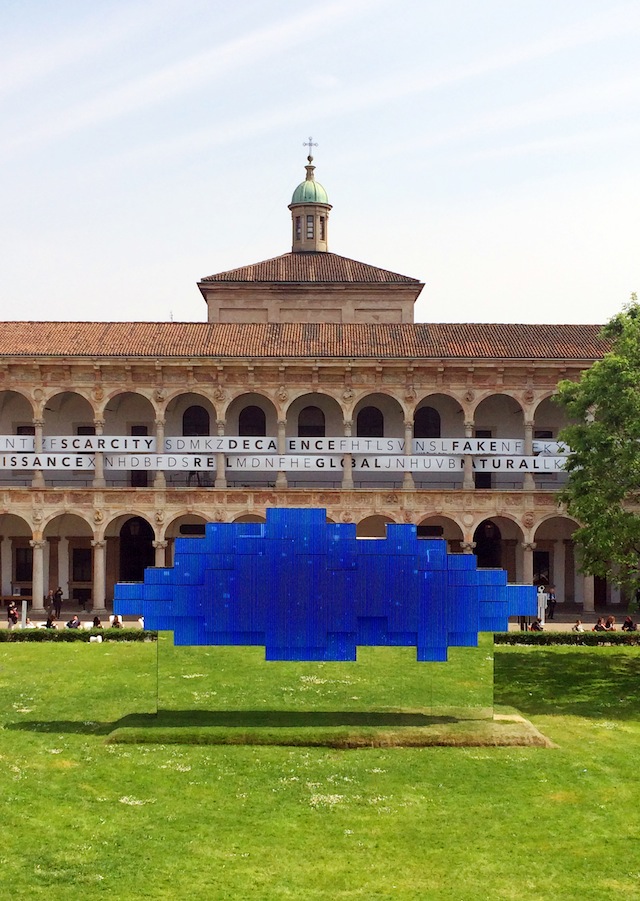
It turned out to be a great way to end our visit—with hardly any of the crowds we’d previously encountered in Tortona, lots of big, playful and imaginative installations, and refreshing bursts of color.

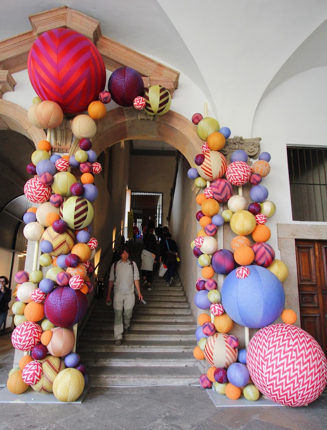
Milan Salone del Mobile 2014 giant textile balls

Milan Salone del Mobile 2014 Endless Stairs

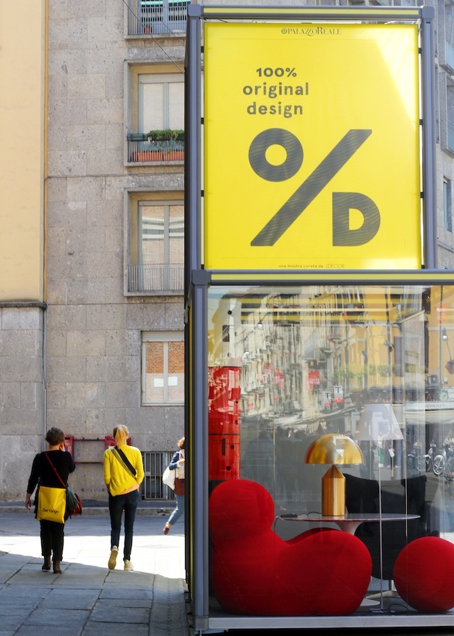
Milan Salone del Mobile 2014 copper pendant lamp

I love looking at beautiful things as much as anyone, but after a while I had begun to crave something a little more conceptual, more thoughtful—more than just someone trying to push another product. Maybe I’m just idealistic, maybe these installations at the University of Milan were trying to sell something too, but they certainly did it in a more subtle way. By pondering big questions such as scarcity, sustainability, the future of cities, and more, they created an opportunity—in the midst of all the activity of the Salone—to pause for a little reflection.

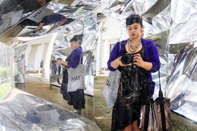
Milan Salone del Mobile 2014 mirror selfie

Reflection, get it? Bada-boom-tsss! Thank you, ladies and gentlemen, you’ve been a great audience.

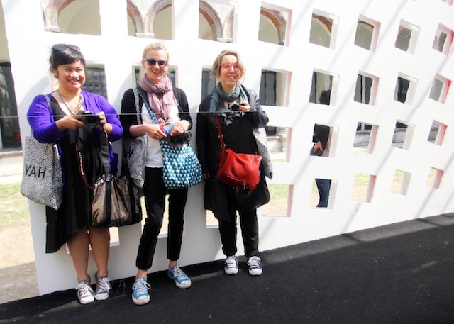
Milan Salone del Mobile 2014 Blago travel buddies

Oh, look at me being all profound and meaningful when in fact I’m just another shallow girl who can’t resist taking a selfie!

Speaking of meaningful, I hope you’re having a rich and meaningful Easter weekend. From what I’m seeing on Instagram, everyone back home seems to be partying at the beach, but I wish you a few quiets moment to reflect, recharge and to celebrate all that is sacred to you. Have a blessed and peaceful Easter!
Milan: Design spotting in Brera

I considered sharing my recent travels in chronological order, but with my #blago2014 travel buddies Jillian and Judith getting a head start on our adventures at this year’s Salone del Mobile, I decided it would be more fun to blog about Milan alongside them. Won’t it be interesting to see four different sides of the same story? Mine begins in the impossibly stylish district of Brera.

Milan Salone del Mobile 2014 Brera Design District

Populated by designer names, elegant boutiques and impeccably dressed residents, Brera is a hotbed of activity of Milan’s very own Design Week.

Milan Salone del Mobile 2014 Brera

Brera opens its polished, darkened doors to the masses during Salone del Mobile. It was an incredible experience to just wander around, popping in and out of upscale shops and showrooms, swept up in an Italian-designed lifestyle that 99% of us can only ever admire from afar.

[Read more...]

Stedelijk Museum bookshop & ABC3D

For me, no museum visit is complete without a stop at the bookshop. Amsterdam’s museums have terrific ones, and the ever business-savvy Dutch have cleverly ensured that at the major museums (the Van Gogh, Rijksmuseum and Stedelijk), visitors can access the bookshops without having to buy a ticket to the museum itself.

Our family trip to the Stedelijk ended, naturally, with a visit to the museum’s stunning shop.

Stedelijk Museum bookshop

Not only does it look like a really nice place to just sit and browse art books…

Stedelijk bookshop

but it also has a great little selection of design gifts and goodies. I had my “mommy glasses” on (the parental equivalent of beer goggles) and zeroed in immediately on the children’s section, which has design-y books in English, Dutch and—my personal favorite—children’s books that can be read in any language.

This is how I found Tala’s first alphabet: a pop-up book called ABC3D by Parisian graphic designer Marion Bataille.

Marion Bataille ABC3D

The holographic cover alone promises something different. This isn’t your ordinary alphabet!

Marion Bataille ABC3D holographic cover

I love pop-up books for the sense of fun and surprise they bring to reading, and ABC3D combines those elements with some seriously cool type design. I looked for our family’s initials and took a few shots to show you.

[Read more...]

DIY mobile with paper ornaments

Tala’s nursery is a work in progress, and it’s finally starting to come together. When I have a bit of spare time and energy I work on little touches here and there. And I’m having fun!

I’ve been looking for ways to help Tala develop her visual acuity, so one of my recent projects was a DIY mobile to hang over her changing mat, for her to look at during nappy changes. After window shopping for baby mobiles online, I realized that many of them are made for adults to look at—that is, pretty from the side but not from below, which is the baby’s perspective.

Luckily, one of my baby shower gifts was a pack of pop-out paper ornaments by Dutch designer Jurianne Matter. Putting together a DIY mobile with these was super easy. I simply popped out the ornaments, folded them as per instructions on the package, and strung them with varying lengths of embroidery thread from a wooden embroidery hoop, which I then wrapped with washi tape.

Paper mobile for nursery

Not only are the ornaments cute, colorful (love the touches of neon!) and graphic, but they also fold out into 3D shapes, making them interesting to look at from the underside—not just for mommy, but for baby too.

Paper ornaments Jurianne Matter

The ornaments are still pretty thin and low-contrast for Tala at this stage, but she’s started looking at them more and more. I blow gently at the top of the mobile to get the circles moving and draw her interest. I love seeing her try to focus on the shapes, knowing that they are getting clearer as her vision develops.

Tala and mobile

I have a few other projects in the works, so more nursery details to come!

Inside Design Amsterdam: Kids on Roof

It should probably come as no surprise that my absolute favorite find from Inside Design Amsterdam was a kids’ brand. Yep, those hormones are kicking in all right. It was love at first sight for me and Kids on Roof, a Dutch company that makes colorful toys with a modern, architectural but still very playful feel.

I wanted to buy everything! A flock of swallows to hang over a crib, a playfully modern cardboard city to build and populate

a white cardboard house to decorate, a little tent for the back yard…

… and a rocket ship to reach for the stars.

Can you tell that I am already so excited for this baby? Little Mango has yet to grow proper toenails and bones, and here I am already dreaming of all the colors we’ll paint, the stories we’ll make up, the places we’ll go, the nights I will sing him to sleep under the stars.

Since Little Mango has a long, long way to go before he can start his astronaut training or camp in the back yard, I was able to resist my hormonal impulses to ransack Kids on Roof’s room at Inside Design Amsterdam. I also let out a little steam by buying this irresistible People of the World coloring book.

I love how the simple line art allows kids to create their own features, clothing, and details instead of just coloring them in. How fun is that?


I will just have to hang on to this until Little Mango’s fingers are ready to grasp crayons and start drawing. Let’s hope I can resist the urge to break out the crayons and beat her to it!

Inside Design Amsterdam

Last week, I entered a contest on Petite Passport for tickets to Inside Design Amsterdam (IDA 2012), Elle Decoration’s annual showcase of Dutch design. I never win these things, so I was thrilled when I did win! Filipinos believe pregnant women are lucky, and in this case the superstition proved true.

Marlon and I spent an enjoyable (but cold) Saturday afternoon exploring the IDA 2012 route on IJburg, one of Amsterdam’s newest, most unique and design-friendly districts. The products, exhibits, even the neighborhood itself was designed and styled so appealingly, I must have taken over a hundred photos. It was difficult, but I managed to whittle down my favorites from IDA 2012 to a manageable list of 10… well, except one that just deserves a separate post.

Here are my top 10 favorites from Inside Design Amsterdam, starting with the one I actually took home:

This necklace by Yvon Visser, made of concrete and wooden beads, felt like a perfect token to commemorate our house hunt. Hopefully this is a sign that we’ll find our own little house soon.

House necklace Yvon Visser

When we do, I will think of the perfect spot to hang this clever paper pendant light: the Helix by Marc de Groot.

Helix pendant light Marc de Groot

These ABC necklaces by Sandra Turina were so cute, and so cleverly displayed.

ABC necklaces Sandra Turina

I have baby brain at the moment, so I couldn’t help thinking about how fun it would be to create an alphabet with found objects and unusual words to hang in the nursery. Filing the idea away for future use…

[Read more...]